Building Trust Through Clear Design
Clarity, restraint, and consistency aren't just aesthetic preferences — they're trust signals. This post breaks down how clean visual systems make products feel more credible before a user reads a single word.
6 min read
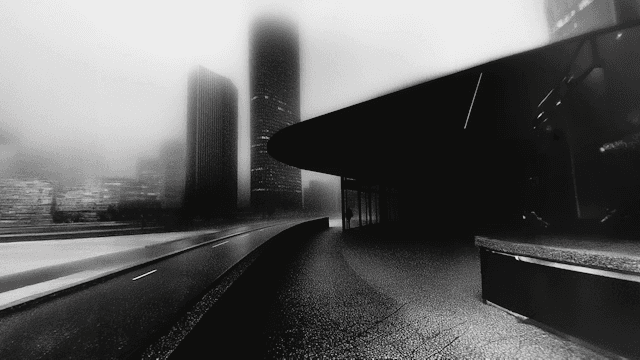
Why Trust Starts Before the First Click
Before a user reads your copy or tests your product, they've already formed a judgment — usually within 50 milliseconds. That snap decision is almost entirely visual: spacing, contrast, typography, and how "finished" something feels. Design isn't decoration in this moment. It's the first sentence of a credibility argument.
Clarity Over Decoration
The instinct when a product feels unfinished is to add more — more color, more motion, more visual flourish. In practice, the opposite usually works better. Removing anything that doesn't serve a function makes the things that remain feel intentional. A single well-placed accent color reads as confident; five competing gradients read as uncertain.
This is the core idea behind anti-glassmorphism design principles: transparency and blur effects were novel for a season, but they rarely help users understand what's actionable versus decorative. Solid, purposeful surfaces do.
Consistency Is a Promise
Every inconsistency in a product — a button that behaves differently on two screens, a spacing rhythm that breaks without reason — quietly tells the user "we didn't check this carefully." Consistency across an entire product is one of the cheapest, most effective trust signals available, because it's evidence of care that compounds across every screen a user touches.
Practical places this shows up:
Type scale and spacing units used identically across every page
Motion that only fires in response to real state changes, never for show
A single, disciplined color system rather than one color per feature
Trust Is Earned in the Details
Loading states, empty states, error messages — these are the moments products are judged most harshly, because something has already gone slightly wrong. A calm, well-designed error state does more for trust than a beautiful landing page, because it proves the product was built by someone who thought about the bad days, not just the good ones.
The Long Game
Trust through design isn't a single choice — it's the sum of hundreds of small, disciplined ones. The brands and products that feel most reliable are rarely the flashiest. They're the ones where nothing feels like an accident.
Join the newsletter
Be the first to read our articles.